The measurement data is visualized using diagram widgets. This chapter introduces you to the common chart types and functions. More information about widgets can be found in the Widgets Widgets chapter.
¶ Chart Types
The Charts diagram widget package contains various diagrams that are available for displaying your measured values. A distinction is made between diagrams for time series and latest values.

| Chart types | |
| Line Diagram |
 |
| Bar Graph |
 |
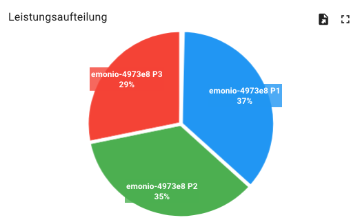
| Pie Chart |
 |
¶ Point Query
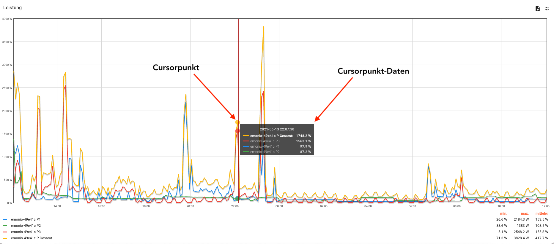
Hover your cursor over the chart to see the point values of the readings.
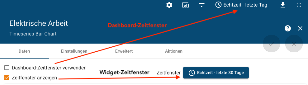
¶ Free Choice of Temporal Resolution
You determine the temporal resolution of your diagram via the time window settings of the dashboard time window or the widget time window. Select the appropriate settings option in the widget settings.
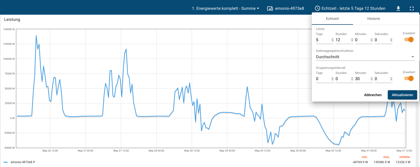
You have the choice between real-time or historical resolution with freely selectable limits and grouping intervals.
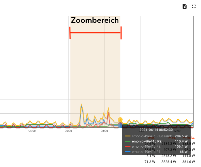
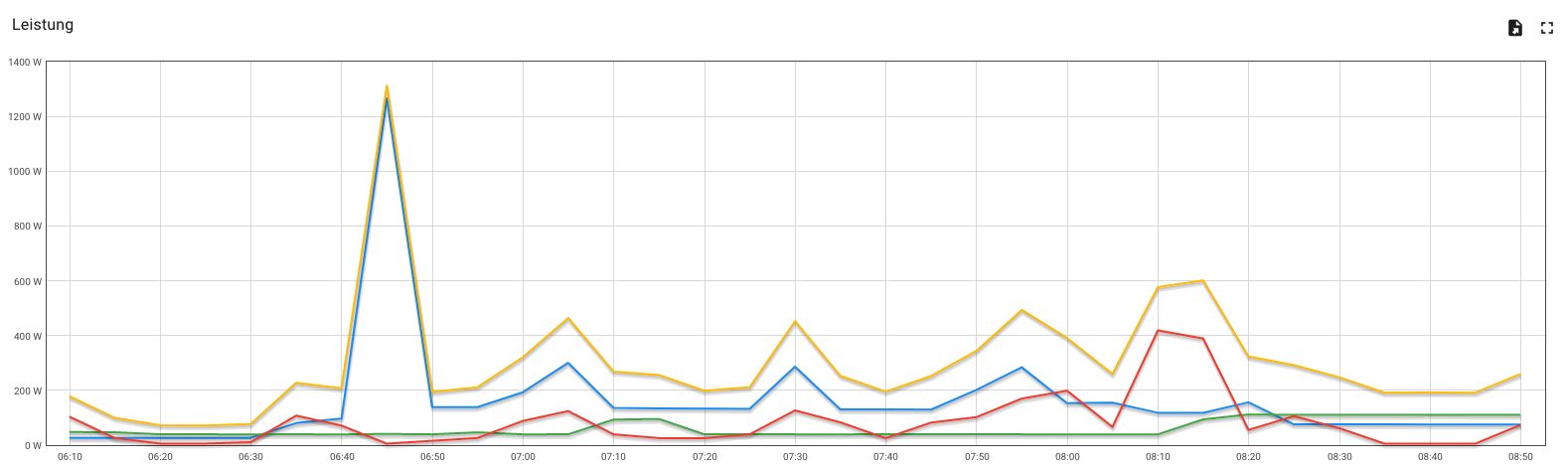
In addition, the diagrams' zoom function allows you to take a closer look at specific sections of the diagram. The zoom area is set by clicking and dragging the cursor on the chart.
 |
 |
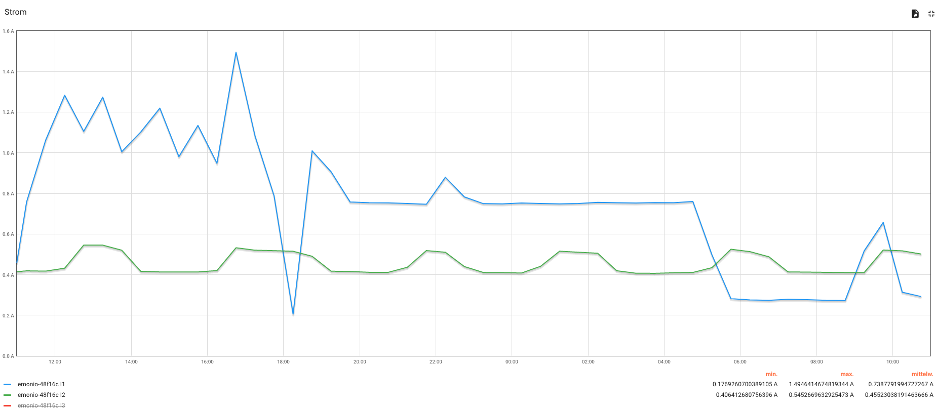
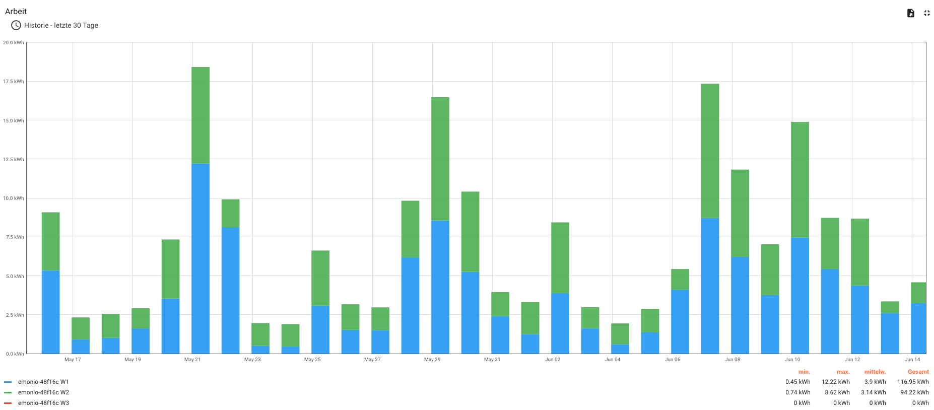
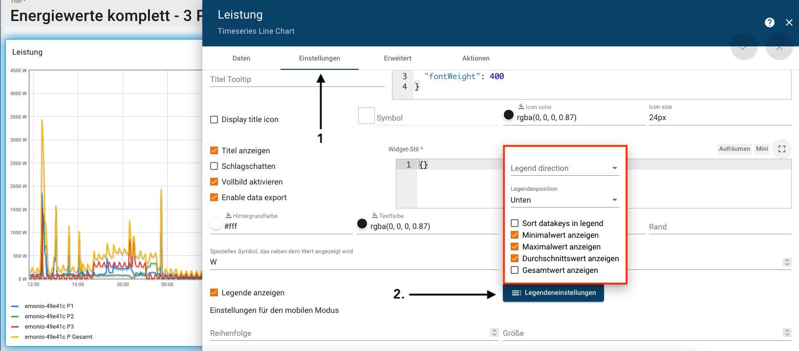
¶ Show Mathematical Quantities
In the legend settings of the widgets, you can show mathematical quantities in the diagram (see figure 1). The values depend on the observation period, which can be set individually (see Figure 2).
|

|
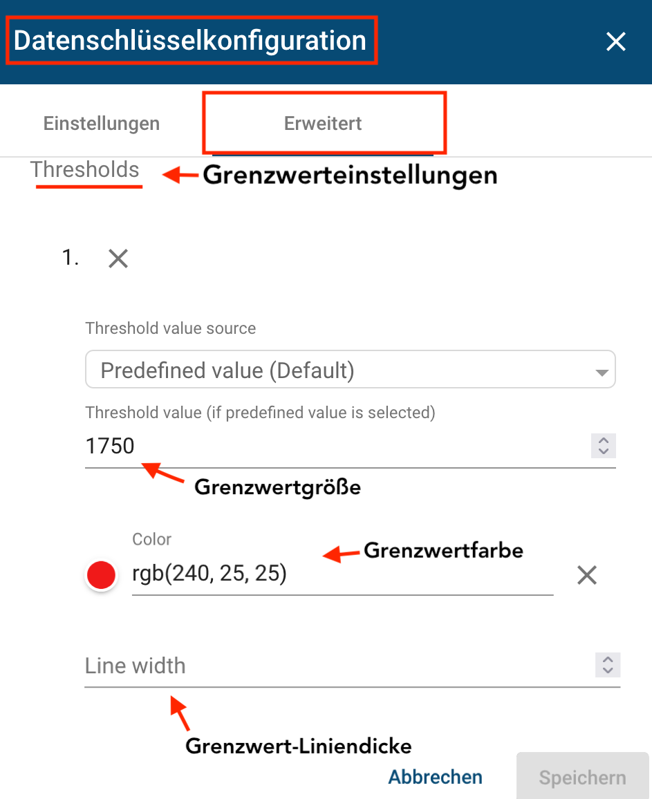
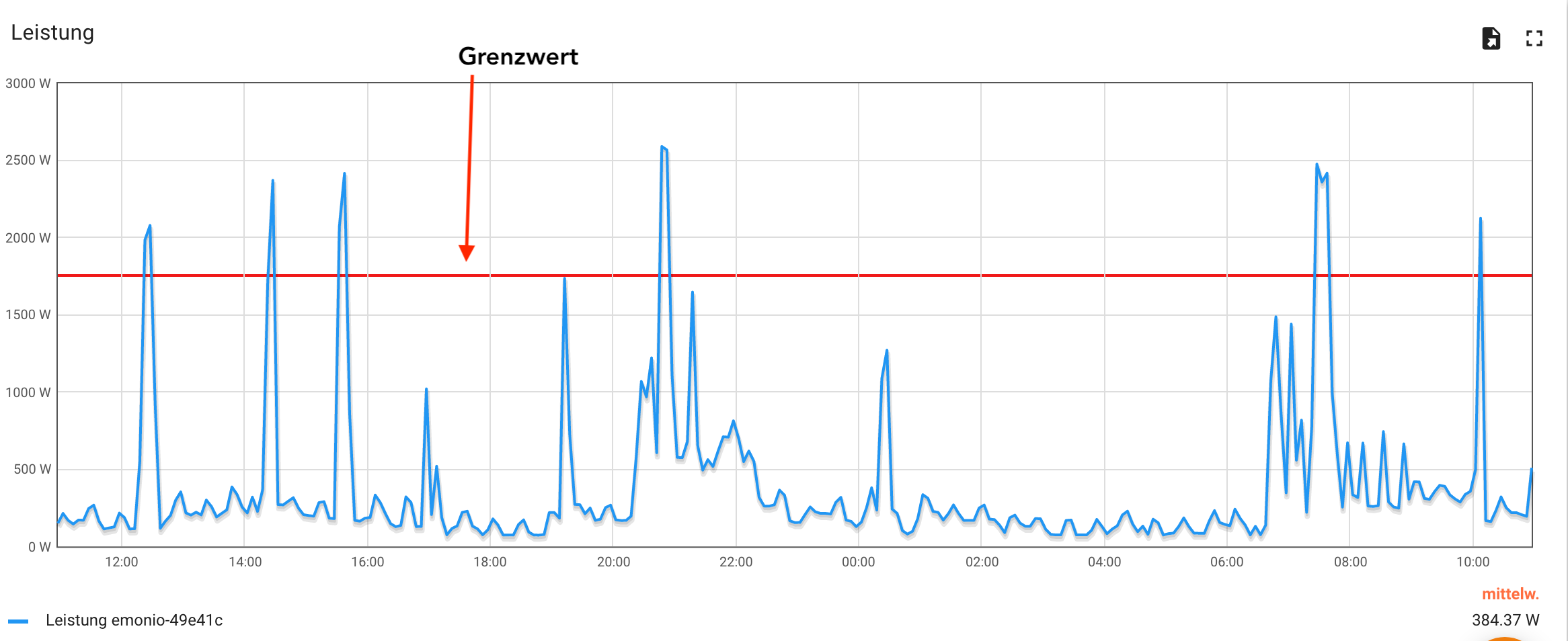
¶ Show Limits
You can view and configure limits through the advanced settings of the widgets data key configuration. In addition to the limit value, the color and line width of the limit value can be set.
 |
 |